
Movie titles are more than just words on the screen, they are a visual introduction to the story, tone, and emotion of a film. The moment a viewer sees the title, they begin forming expectations about the genre, mood, and style. Designing cinematic titles requires more than technical skill, it demands an understanding of how movie fonts communicate atmosphere and storytelling before a single scene begins. Choosing the right movie font can turn a simple title into a cinematic masterpiece.
Choosing the Right Font Style for the Genre
Each genre has its own visual language, and font choice should reflect it. Action and adventure films often use bold, heavy fonts with sharp lines or metallic effects. They communicate power and excitement. Fonts like TT Octosquares or TT Trailers from typetype.org are perfect examples of modern, high-energy styles suited for cinematic visuals.
Horror films tend to use rough or serif-heavy fonts with irregular edges to create suspense. Period dramas work beautifully with classical serif designs like TT Ricordi Marmo, which convey sophistication and history. For futuristic or sci-fi films, geometric sans serifs such as TT Interphases or TT Norms Pro express innovation and technology.
Selecting a font that fits the movie’s genre ensures the title feels like part of the story rather than just a design element.
See also: Everything You Need to Know About Making Bread at Home
Crafting Layout and Composition
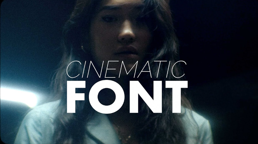
How the title is arranged plays a vital role in its cinematic appeal. Layout determines rhythm, balance, and viewer focus. Large uppercase letters give strength and authority, while wide spacing or lowercase text can feel calm and reflective.
Contrast adds energy. Mixing different weights, using color shifts, or layering text over visuals helps the title stand out. Motion can also enhance drama, a slow fade-in or glowing animation makes the typography feel alive on screen.
Even in posters or still designs, composition should mimic cinematic flow. The viewer’s eyes should naturally move from the title to supporting text, creating a complete visual story.
Using Color and Effects for Cinematic Impact
Color adds emotional meaning to typography. Deep reds can signal passion or danger, while golds and silvers bring elegance and prestige. Adding gradients, shadows, or subtle lighting can make the text appear three-dimensional and more realistic.
Texture effects like smoke, film grain, or light leaks also help connect the title to the movie’s tone. A distressed font with warm tones might feel nostalgic, while neon glows with sleek shapes can create a futuristic feel.
The goal is to make the text part of the film’s world, not separate from it.
Balancing Creativity and Legibility
Expressive fonts make titles memorable, but readability must always come first. Viewers should recognize the title instantly, even against complex backgrounds. Designers achieve this by keeping strong contrast, clear spacing, and avoiding overly detailed letterforms.
A good balance is to pair a decorative font for the title with a simpler font for subtext or credits. For instance, TT Ricordi Allegria can work for the main headline, while TT Commons Pro can handle smaller text without losing harmony.
Conclusion
Designing cinematic titles with movie fonts is about combining creativity, storytelling, and technical precision. The right font not only defines the film’s visual identity but also sets the emotional stage before the first scene unfolds. By mastering genre styles, composition, color, and clarity, designers can create titles that truly feel cinematic. Fonts like TT Octosquares, TT Trailers, or TT Ricordi Marmo from typetype.org bring authenticity and power to visual storytelling. In the end, great movie fonts don’t just introduce the film, they become part of the story itself, leaving a lasting impression long after the credits roll.